By MICHAEL S
This article was originally written for JumpStory. You can check it here.
A picture is worth a thousand words. You have heard that saying over and over I’m sure, and there is a good reason for that.
It’s not that images talk more than your copy, but they influence triggers inside your brain that communicate with some important parts causing you to relate in a way that words would never be able to.
This system called the semantic network of the brain which is basically a giant interconnected web of knowledge containing everything that you know.

It would be too long and quite boring to explain how it exactly works but the point is that images can prime concepts in this network, through the millions of connections, which then can influence your perception and behavior.
That’s the reason why you should choose your images and photos consciously, taking into consideration the associations that they will activate.
And when it comes to email marketing you should activate concepts that will trigger a desire to click through and convert!
Email is a private experience. Unlike social media or websites where the content is public email provides a personal space. A feeling that this particular message is just for you. which can further increase the effect of the images you use in it.
In this article, I’ll provide some examples of images that you can use to prime your subscribers in two kinds of decision-making situations.
During Rational Decision Making and Emotional Decision Making.
Images for Rational Decision Making
It happens when people act and decide from a logical standpoint. So, not surprisingly you should prime their concept of rationality.
When these associations get activated in their semantic network, they will be more likely to realize the rational reasons to convert.
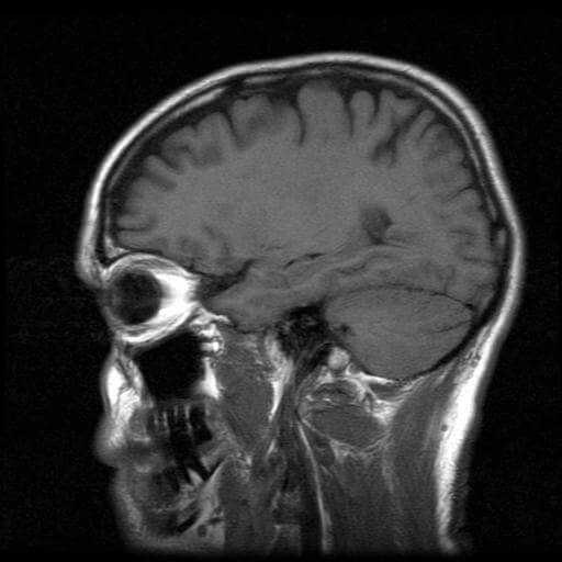
1. Brain Images from MRI

Funnily, when you use a photo of a brain (especially a photo from an MRI), you’ll have a higher chance of triggering associations with analytical thinking. And they’ll also view your content to be more credible.
2. The “cliché” business images
Everybody knows these… But how useful are they in reality?

Actually, in certain situations, they can be pretty effective. If your offer provides people with a rational set of benefits, priming their concept of business will trigger a “what’s-in-it-for-me” mindset, which can then lead to appreciating the logical benefits of converting.
3. Images of Asian Males
I know it sounds a little bit racist but hold with me.
Just like everything else in our semantic network, age, gender and race are associated with certain qualities and characteristics. Even if we think that we don’t believe in stereotypes they still influence us subconsciously.

Since the stereotype of an Asian person is mostly associated with superior math and analytical skills, you can use images to prime that association. Also, the stereotype of men is associated with more rational thinking, using images with that gender should be also more effective to trigger a more rational state of mind.
Images for Emotional Decision Making
Opposite to Rational Decision Making, in this case, the goal is to influence people to use their emotions when deciding to convert.
1. Playful Cuteness
When your product involves an emotional decision or if your niche involves some type of indulgence, for example, baby or animal/pet products, you should use some whimsically cute image in your emails. Those images will prime the concept of fun and happiness making people more likely to get entertained.

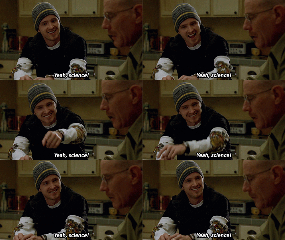
2. Images with Smiling People
When we are in a fun and happy mood, we’re more likely to base decisions on emotions. The positive vibe creates a sense of naive optimism. We falsely assume that the information we just consume must be accurate so we don’t spend too much time rationalizing.
What is the best way to trigger that mood? Show images with smiling people! 🙂
Try to choose photos where people are using an open body posture and not crossing their arms for example. The body language of the models is another really important factor.

3. Images where people looking toward your email CTA
This technique can work with every kind of decision making but it has the strongest impact on the emotional one.
It’s pretty self-explanatory, to make your subscribers convert, you should position the people in your photos to face toward the email CTA.
The reason why this works because we have a natural tendency to follow people’s gaze. It’s an evolutionary trait that helps us learn about the world.
If you face a person to your email’s CTA button, for example, people will have a stronger desire to click on it.

I hope this blog was useful for you and the next time when you choose a stock photo you will think about the associations that it can trigger.

